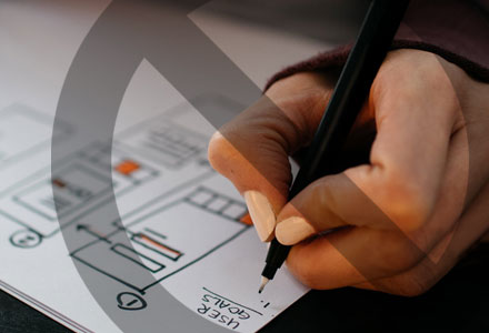
Considering how to effectively use fonts within your design projects is a learning process. When it comes to selecting that perfect font, it can be a good idea to list some of the qualities and tone of message that you want to communicate through your design.
How to choose a font
Which style of font suits the project you are working on? What size is the final piece of work? It is important to consider this when choosing the font style for your project as using a typeface on an A3 poster may not work or read well when shrunk down to display on a smaller project such as a business card.
There are a number of styles available to choose from, including;
- Serif fonts - Serif fonts are seen by many as a more serious and traditional option to other fonts and feature feet or lines at the end of each letter.
- Sans-serif fonts - Sans-serif basically means “without serif”. These fonts are generally more modern looking and don’t have the feet on the ends of letters making them a more streamlined choice. The sans-serif font is a popular choice for use on web design projects as well, as they display content clearly across various devices.
- Script fonts - Script fonts will generally have connecting letters and carry the style of calligraphy or handwriting. Script fonts have a place within design projects if used appropriately but it is not advised to use this style of font for large blocks of text.
- Decorative or display fonts - This style of font is commonly used to grab attention. They should only be used in small doses and should entice the audience into reading the rest of the copy within the design where either a serif or sans-serif font should be considered to complement it.
Other considerations
Kerning, tracking and leading
This relates to the amount of space surrounding text and can be just as important as the choice of font. Kerning is the adjustment of space between a designated pair of characters; while tracking is the space between groups of characters. Leading refers to the amount of space between lines of text. These adjustments combined can help paragraphs of text become more legible to the reader.
Number of fonts being used
When working on any design project, it is important to consider the amount of fonts being used. We would recommend using no more than three fonts to avoid the design becoming messy and confused.
There are exceptions to this rule, for example, if you are designing a flyer which offers a selection of events, each of which has its own specific font, then this is where the rule can be broken. In this instance, you will have to put your design skills to the test to bring each event together in harmony on the project, for this the use of colours can come into play.
Contrast
If there is not enough contrast between text and the background colour then the font can become unreadable. There are a number of elements that can contribute to the contrast including font size, stroke weight and colour.
Font resources
There are a vast number of fonts available that are free to download and use on your design projects. Below we have listed just a few of our favourites and where you can find them.

graphicpear.com

behance.net

behance.net
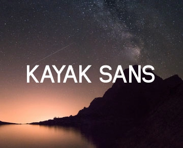
behance.net

atipofoundry.com
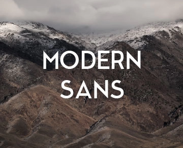
behance.net

zetafonts.com/napo

fontsquirrel.com

graphicpear.com

fontspring.com
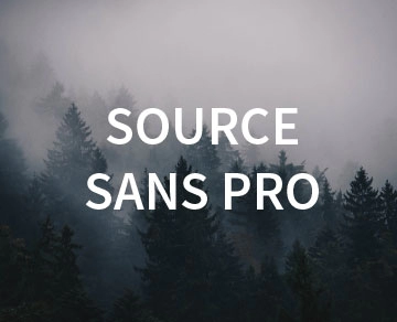
fontsquirrel.com

pixelsurplus.com


