Every four years, the World Cup takes over our screens. This time, it also took over one of the most visited pages on the internet.
Most World Cup marketing revolves around teams, individual superstars, national pride, and competition. Google took a different route.
During this year’s World Cup, Google didn’t launch a loud, high-profile campaign. Instead, they did something far more interesting: they quietly transformed their homepage through a series of World Cup-themed doodles.
If you’ve ever landed on Google’s homepage during a major moment, you already know the drill: the logo transforms into something playful, unexpected, and instantly relevant. But for this World Cup, Google didn’t just celebrate the event; they celebrated the art of the game. From curling free kicks to gravity-defying bicycle kicks, each design captures a move fans recognise immediately, no commentary needed.
At first glance, they’re simple. Playful illustrations. Light animations. Easy to overlook. But strategically, they’re doing something very deliberate. In this piece, we explore what makes this campaign unique and what takeaways businesses should consider to better connect with their customers through creative design.
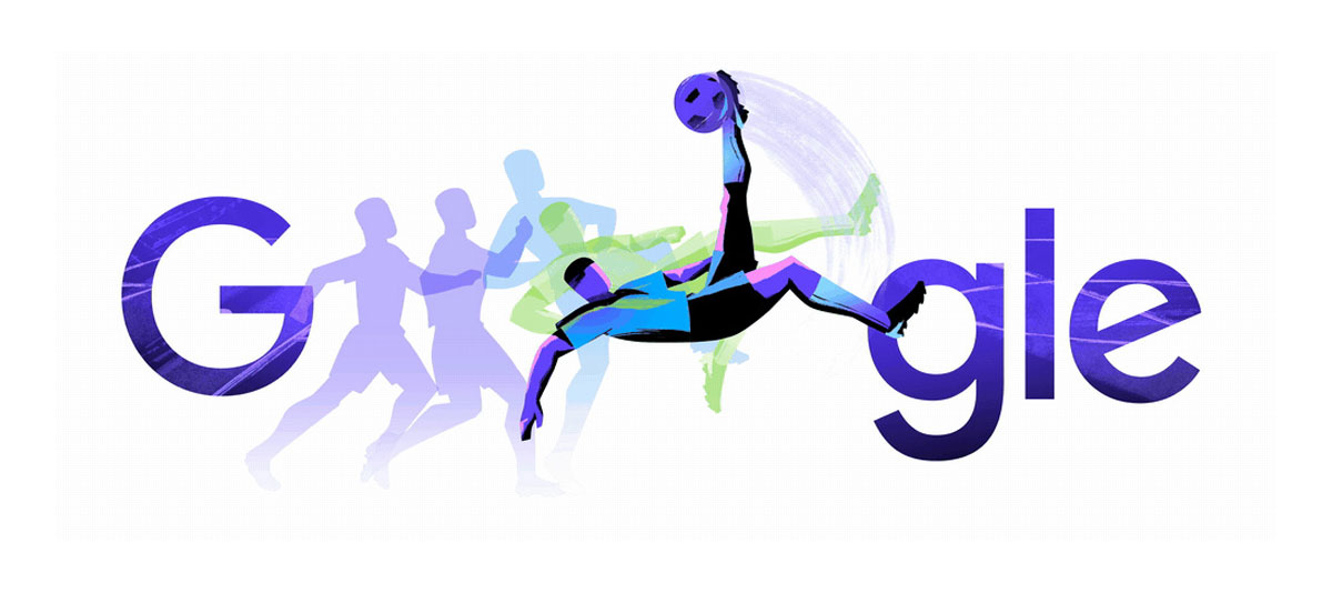
Image: Google
Watch the animation in action
They focus on the universal, not the divisive
This matters because teams divide audiences, but moments unite them.
By focusing on the artistry of the game rather than the outcome, Google creates something globally relevant without needing to localise it for every market. You don’t need to support a specific team to feel the impact of a perfectly struck ball or a last-minute save. And great design should feel both personal and instantly recognisable, which is the case here.
They show up without interrupting
Modern audiences are increasingly resistant to being interrupted. Google’s advantage is its platform, but what’s notable is how lightly they have used it.
The doodles don’t demand attention or disrupt the user journey. They simply exist within it and yet, they’re seen by millions.
This is a powerful reminder that visibility doesn’t have to come at the cost of experience.
They align the brand with the moment
What makes this campaign stand out is its subtlety. There’s no hard sell, no big message, just beautifully crafted visuals that align Google with creativity, culture, and global connection.
Sometimes the most powerful brand storytelling doesn’t shout. It shows up, feels relevant, and lets the audience connect the dots. In this case, Google didn’t try to own the World Cup; they simply reflected what people already love about it - and did it beautifully.
This is an approach we believe in at Blue Frontier. Whether we’re designing a website, digital product, or brand experience, our focus is on creating a journey and experience that connects and communicates with the audience. Your visual assets don’t just make your brand look and feel good; they build the story of your brand and shape how your customers see and engage with you.
Get in touch with us if you would like to discuss how we can create engaging visual assets to elevate your brand.