
When people think about great web design, they often focus on bold visuals or striking branding. But increasingly, it is the smallest details that make the biggest difference.
Today, users expect websites to feel effortless to use, and they quickly bounce off a website that feels clunky, unintuitive, or difficult to navigate.
That is where micro-interactions come in. These subtle moments of feedback help guide users through the website, making every interaction feel more natural and engaging. While they might seem like minor design details, these micro-interactions can significantly improve usability and ultimately conversions.
In this article, we'll explore what micro-interactions are, why they're becoming increasingly important, and how businesses can use them strategically to create better digital experiences.
What are micro-interactions and why do they matter?
Micro-interactions are small, purposeful animations or responses that occur when a user performs an action on a website or app. The subtle movements are designed to signal feedback to users, guiding them through tasks with ease.
Think of a tick appearing after you've successfully completed a form field, or a loading animation while content loads. Individually, they're small animations, but together they create an experience that gives users confidence as they navigate your website or app.
The importance of micro-interactions comes at a time when the focus has shifted from simply designing attractive websites to creating memorable experiences. As digital experiences have evolved, businesses can no longer rely on aesthetics alone. Today’s users expect websites to communicate clearly at every stage of their journey.
The psychology behind subtle UX feedback
We may not realise it, but we all naturally seek reassurance when interacting with websites and apps. Every click, tap, or swipe creates an expectation that something will happen. Micro-interactions satisfy that expectation.
When users receive immediate visual feedback on the back of an action, uncertainty is removed. They know whether an action has been successful, reducing friction throughout the journey in a way that builds trust.
Well-designed micro-interactions also create a sense of responsiveness. Rather than feeling static, websites feel alive and interactive, encouraging users to continue exploring. Some of the most effective micro-interaction examples include:
- Buttons that respond on hover, click, or when disabled.
- Form validation cues that instantly highlight errors or confirm successful inputs.
- Progress indicators showing how far users are through a purchase, booking, or registration process.
- Success animations confirming actions like submitting a form or adding an item to a basket.
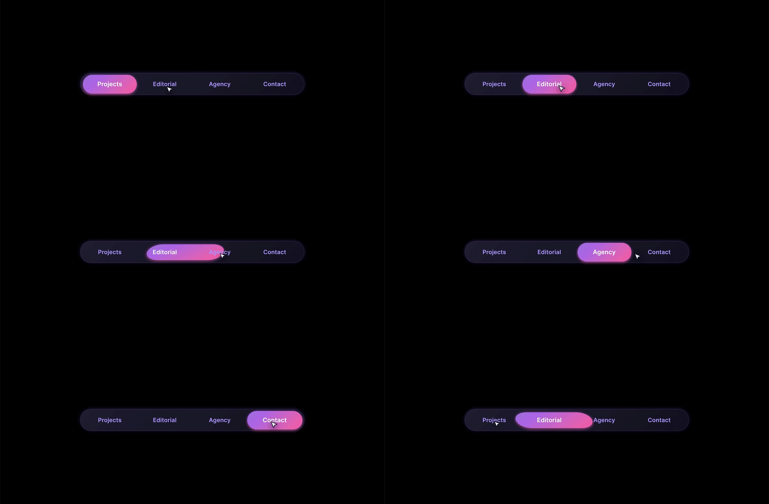
- Interactive navigation that clearly indicates where users are within a website.
These small animations reduce cognitive effort, allowing visitors to focus on their goals instead of figuring out how the interface works.

High-impact micro-interactions that boost engagement
Micro-interactions are not only key to improving the user experience. The most effective micro-interactions work to purposefully steer users towards desired actions.
Hover effects are one of the simplest yet most effective micro-interactions. Animations on navigation menus, content cards, and calls-to-action provide clear visual cues about what is interactive, encouraging users to explore the site with confidence.
Button transitions also contribute to a more intuitive experience. Smooth animations when a button is clicked provide instant confirmation that an action has been recognised, reassuring users that the website is responding as expected.
Scroll-triggered animations help reveal content progressively as users move down a page. Rather than displaying everything at once, they guide attention naturally, making information easier to digest while creating a more engaging reading experience.
Loading states are another valuable opportunity to improve the user experience. While waiting is unavoidable, thoughtful loading indicators such as skeleton screens, subtle progress bars, and lightweight animations reduce perceived waiting times by reassuring users that content is on its way.
Ultimately, the goal isn't to fill every corner of a website with movement. The most effective micro UX remains almost invisible, quietly supporting users, maintaining engagement, and helping them complete tasks with ease.
Finding the right balance
One of the biggest mistakes businesses make is assuming more animation equals better UX.
When every element moves, fades, or bounces, users quickly become distracted. Instead of improving usability, excessive animation creates noise and makes the interface feel more cluttered.
Good micro-interactions are subtle enough that users rarely notice them consciously. They simply experience a website that feels smooth and intuitive.
It is worth noting that heavy animations can also impact performance, increasing page loading times, particularly on mobile devices, directly affecting both SEO performance and user satisfaction.
Accessibility should also be a priority. Some users experience motion sensitivity, so websites should respect reduced motion preferences while still providing clear feedback through alternative visual cues.

The business impact of great UX
The business value of polished UX is not to be underestimated. When users feel confident navigating a website, they're more likely to stay engaged, complete key actions, and return in the future. Businesses often see improvements in:
- Increased time spent on site through more engaging interactions.
- Higher click-through rates on calls-to-action.
- Lower bounce rates as users encounter fewer points of friction.
- Improved form completion through clearer validation and guidance.
- Stronger brand perception by creating polished, premium digital experiences.
Every small interaction contributes to the overall perception of your business. Customers may not consciously remember a button animation or loading state, but they'll remember how easy and enjoyable your website felt to use.

Best practices for implementing micro-interactions
When introducing micro-interactions into your website or app, focus on quality rather than quantity. Some key principles include:
- Keep animations short, typically between 100 and 300 milliseconds, to maintain responsiveness.
- Ensure interactions remain consistent across every page and user journey.
- Design with mobile-first interactions in mind, recognising that touch interfaces behave differently from desktop experiences.
- Prioritise accessibility by supporting reduced motion preferences and ensuring interactions remain understandable without animation.
- Match interaction styles to your brand personality. A creative consumer brand may embrace playful motion, while professional B2B organisations often benefit from more refined, understated interactions.
- Always test interactions with real users to ensure they genuinely improve usability rather than simply adding visual flair.
Ultimately, every animation should have a purpose. If it doesn't improve clarity, provide feedback, or guide users towards an action, it probably isn't needed.

Partner with us
As user expectations continue to evolve, thoughtful UX design has become a competitive advantage. The smallest design decisions often have the greatest impact on how customers perceive your brand, interact with your website, and ultimately decide whether to convert.
At Blue Frontier, our experienced design and UX specialists create websites that do more than look great; they're built around user behaviour, accessibility, and measurable business outcomes. From intuitive user journeys to carefully crafted micro-interactions, we design digital experiences that keep visitors engaged and help businesses achieve their goals.
Get in touch with our team to discuss your website needs today.